TikTok User Interface: Explaining TikTok’s Design Choices
A Chinese tech giant created the social media app TikTok in 2016 but launched it worldwide in 2018. The app grew popular and had more downloads than Facebook, Snapchat, Instagram, and YouTube. By 2019, during the COVID pandemic, TikTok had risen to fourth on the list of most downloaded non-gaming apps. But what makes this app thrive? The rapid growth and dominance result from the amazing TikTok User Interface.
TikTok’s simple yet immersive UI/UX design is understandable and easy to navigate. Therefore, users can perform actions efficiently and easily create and watch relevant content. Hence, the ease of operability draws users to the app. Thanks to the design choices and graphical arrangement, TikTok boasts a large user base with over a billion users. As a TikTok content creator or influencer seeking growth, you should understand the interface perfectly.

Analyzing the TikTok Design: How Does the Design Impact User Experience?
Thanks to its outlook, the consumer web company TikTok is a mega success in the social world. But what’s so special about the TikTok design that attracts millions worldwide? Observation reveals that TikTok branched out from traditional app designs and experimented with new variables that are working phenomenally.
TikTok’s design follows the structure of the hook model, drawing users to it through understanding consumer behavior. This model then triggers habits that it rewards. So when users download the app, it launches the For You Page. Unlike Instagram or Facebook, you can’t switch to reels, stories, or the following feed as you’ve yet to follow anyone.
So this leaves you with no option but to scroll through TikTok’s FYP by swiping up and down. You’ll notice that the videos autoplay, eliminating the need to press the start button frequently. TikTok’s algorithm curates videos on your FYP according to your interests, so each user’s FYP differs.
When you open the app, you’ll see highly liked videos from your topics of interest. Then, as you scroll, the algorithm customizes your interests with information it collects from user behavior. Also, the algorithm observes the accounts you follow and fills your feed with content from similar accounts.
Hence, uprising content creators, top TikTok influencers, and brands use the platform for advertisements. TikTok is also a favorite choice for influencer marketing. Creators trust the algorithm to deliver content to the right target audience. TikTok’s design personalizes user experience according to niche targeting, leading to a distinct and engaging experience for all.

Why Is the TikTok User Interface Spectacular? How the UI Works
Every social platform operates through a user interface that simplifies actions and enhances communication. It enables users to send Direct Messages, share, like, and comment on posts. An excellent interface has a nice visual appeal and personalization features that can attract and retain users. Thus, it’s necessary for seamless interaction on all social media apps.
TikTok’s download rate and user activity are proof of an excellent interface. The TikTok user interface, alongside its progressive algorithm, continually endears users to it. But are these all that make TikTok’s UI spectacular, or is there more to it? The answer is yes.
One of the factors is the efficient profile layout that presents users with all their needs in one tab. You’ll see your profile picture, social statistics, editing options, TikTok bio, and video content in a pedigree format. You can toggle the content to see your posts, private, favorite, and liked videos.
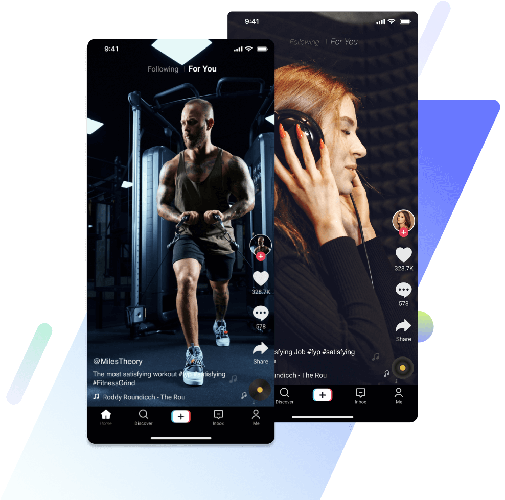
Icons are also accessible in full-screen display mode. You can follow an account, like, comment, bookmark, and share videos. You can also check the video’s sound and swipe left to view the creator’s account. While commenting, your video will still be visible on a portion of your screen, and the sounds will keep playing. With all actions accessible on the feed, the interface keeps users glued to videos.
TikTok’s interface is unique and favors cross-promotion of content to other platforms. Users who post videos on TikTok receive video-sharing notifications at the top of their screens. This notification prompts users to share their creations on other platforms. Also, there are regular prompts to sync your TikTok and Facebook accounts.

Features of the TikTok Interface: Unique Attributes and Their Functions
The TikTok Interface is quite unlike any other. It defies conventional rules but is still making headlines. The reason for this is the many outstanding features of TikTok’s interface. These amazing features eliminate all barriers to content creation and give users a worthwhile experience.
The design guidelines are responsible for the structure of the features. So, let’s peek at some of the features that make TikTok’s graphical layout and outlook pop. TikTok also has numerous creator effects for enhancing video aesthetics. This effect option is easy to find when you open the camera. There are also other tools and filters on the camera screen that aid video production.
Also, TikTok seamlessly integrates with editing apps and AI content creation tools like CapCut. This integration makes it easy to replicate trending TikTok challenges and entertain TikTok followers. You can also use advanced editing features without downloading and re-uploading videos on various platforms.
Additionally, TikTok uses a full-screen display, creating focus for each video as it plays. You can swipe upwards to watch a different video. Thanks to TikTok’s algorithm, you can scroll for infinity as the content never ends. With the swipe interaction model, you can perform all actions by swiping, scrolling, and clicking.
All these are innovative and intriguing features that other apps lack and are attempting to replicate. After TikTok became famous, Instagram introduced the reel and highlight feature, YouTube created shorts, and Facebook adopted reels. Features of TikTok’s interface have become pacesetters for other social media applications. Overall, the design seeks to avoid posing barriers for content creation.

Principles Behind the TikTok UI: UI/UX Laws and Their Implementation
The TikTok UI immerses users in a sea of never-ending pleasure, which is quite addictive. For creators, it takes the stress off producing relevant content. But you may wonder what governing UI/UX principles aid the creation and sustenance of such an interesting interface. There are four principles, which I’ll explain below.
Miller’s Law
A core aim of UI/UX is to liberate users from thinking. According to Miller’s law, tasks that require less mental effort are faster to complete, so people tend to rush them. In the light of TikTok, the app doesn’t require you to crack your brain before using it. There are no rigorous steps to learn.
After all, social media is for relaxation. So TikTok reduces the cognitive load by placing all icons within reach. The videos play automatically without you triggering them. Similarly, all icons are in the thumb zone on the screen. The vertical lineup of icons on the right-hand makes it convenient for users to interact with content easily while scrolling.
Hick’s Law
TikTok’s design team uses Hick’s law in structuring the applications’ interface. Hick’s law states that the more options users have, the harder it is for them to decide. In other words, numerous choices introduce complexities. This law implies that giving users fewer options brings simplicity and spurs interest.
You may wonder how this law is functional in TikTok’s design. TikTok makes it easy for users to enjoy the platform through one action, which is swiping. Once you create an account and open the app, you won’t have to ponder what to watch. The platform and its algorithm naturally curate videos for users.
You can swipe through an endless array of engaging content till you decide to take a break. Due to the feed customization, TikTok easily becomes addictive. Because there is only a single option, there’s no tedious process of learning to use the app. Rather, everything comes naturally. Additionally, users can achieve all actions by simply clicking a few buttons. TikTok is easy to use, thanks to Hick’s law.
Doherty Threshold
This principle bases the speed of human-computer interaction on the fact that users are more attentive to reactive apps. Also, users love controlling the interaction and feeling dominant when they receive immediate responses. TikTok implements this by ensuring that stitch videos, duets, comedy pranks, and all types of content load rapidly.
Therefore, it’s easy to discover new content, and the responsiveness keeps users glued to their screens. The interface also gives users control as they can scroll away from videos they don’t want to watch. Interestingly, this selective ability gives the much-needed feeling of control.
Fitts Law
Fitts law purports that users find it difficult to touch far targets while close ones are more accessible. Also, larger targets are easier to touch. This principle explains why TikTok uses a full-screen display. With the full-screen mode, watching videos and accessing icons is easier.
Changing videos through swiping is also simple. The large surface area makes it easy to make swift vertical finger motions and navigate from one video to another. The combination of all these laws provides a seamless interface that elevates user experience on TikTok. Therefore, it’s easy for you to use TikTok and for viewers to transition to followers with just a simple click.
But if you’re a creator, you shouldn’t depend entirely on the TikTok user interface and algorithm for followers. You should also try TikTok follower growth strategies and employ an advanced growth agency like High Social. Through audience targeting, High Social can help you attain online relevance by connecting you to the right followers. So, start growing your TikTok today!
TikTok 101


